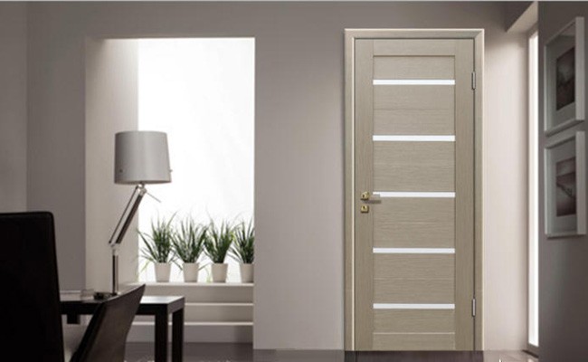
Minimalism style in the interior of the apartment: 8 facts + many photos
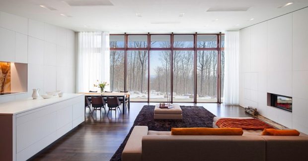
Strictness and restraint, a minimum of pieces of furniture and decor, a pair of primary colors and a special love for the correct geometric shapes - this is exactly how, in general terms, the style of minimalism in the interior of an apartment can be characterized. It seems that he appeared when people were tired of elaborate furniture, gilding, carving, paintings in pompous frames, ubiquitous patterns and numerous decorations. In principle, it was. Minimalism is the best proof that beauty in simplicity. Style has conquered the whole world and is on the crest of popularity. We deal with the main features of this direction and debunk the myth that minimalism cannot be cozy.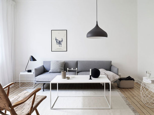
No. 1. A bit of history
Minimalism appealed to perfectionists, lovers of order and owners small apartments. The origins of the style belong to the middle of the twentieth century. Then once popular in Europe modern lost his position and fed up with his romance, ornate shapes and unnecessary accessories. People are tired of ostentatious luxury - they wanted something more practical, functional and restrained. And then there is an indicative example of constructivism, which appeared in the 20-30s. So minimalism was born, which by the end of the century gained wildly popularity, and now considered almost the most popular interior style. Strict geometric shapes, an abundance of free space and light, pure colors and only the most necessary pieces of furniture - these rules allow you to create cozy interiors, regardless of the area of the room.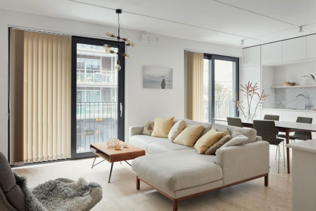
In many countries, there are varieties of minimalism. Japan went the furthest, as Japanese minimalism can already be considered an almost independent interior style.
The popularity of minimalism is explained not only by the wide distribution of compact housing and the need to somehow organize your life. People realized that for comfort they do not need so many things, which means that less money will be needed to equip the apartment. Moreover, in a minimalist room, even with a great desire, it is difficult to make a mess, and in which case it will take a minimum of time to clean. Savings on all fronts, so that along with minimalism in the interior we can talk about minimalism in the field of financial and time costs. Oh how!
No. 2. The main features of the style of minimalism in the interior
It is not possible to describe the features of minimalism as succinctly as this style is. Minimalism is suitable for people who are tired of the abundance of decor, colorful wallpapers, heaps of velvet furniture and immense decoration. Yes, the interior can be cozy even with a minimum of objects.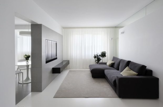
The main features of minimalism:
- minimum furniture - buy only the most necessary. You can’t even imagine how many things you can safely do without;
- minimum decor. Accessories, of course, are present, but in a small amount, they play the role of accents in the interior, color spots. It is better to refuse small decor;
- a lot of lightthat enters the apartment through large window openings. From curtains refuse at all or use blinds. Simple plain plain curtains are also suitable. Artificial lighting is built in several levels. Due to the minimum of objects and high-quality lighting, even a small room looks spacious;

- discreet color scheme. It’s better not to depart from the strict rule of minimalism, which dictates to be used in one space only three colors: two main and one for emphasis. For minimalism choose light shades;
- conciseness of lines and geometric shapes, which is manifested in the choice of furniture, fixtures, the organization of doorways, zoning of space. Straight lines, regular shapes, symmetry in high esteem. It is allowed to use arched lines in a small amount, but in no case spirals;

- free and open space, so that it is better to remove or partially dismantle some partitions;
- combination of natural and industrial materials in decoration: wood combined with glass, chromed metal and plastic, used brickceramic and stone, plaster and bungrespected reflective surfaces;
- down with ornaments and patterns. Furniture, decoration, lamps and other interior details should be monophonic, as simple and concise as possible. Ideally, the furniture merges with the walls;

- there is no need to abandon the mass of really necessary things, they are simply better embed, hide behind furniture facadesput away in dressing room or pantry. The emphasis on modern technology is not accepted - it should be as if dissolved in the surrounding space or even hidden. This is the main difference from another modern style - hi-tech;
- minimum textile.
Minimalism is often confused with asceticism., accusing him of excessive severity and lack of comfort. In minimalism there is comfort, subtle homeliness, special warmth, but not everyone can see it. If you are a fan of using warm colors in the interior, lots of jewelry and small souvenirs, then minimalism is clearly not for you.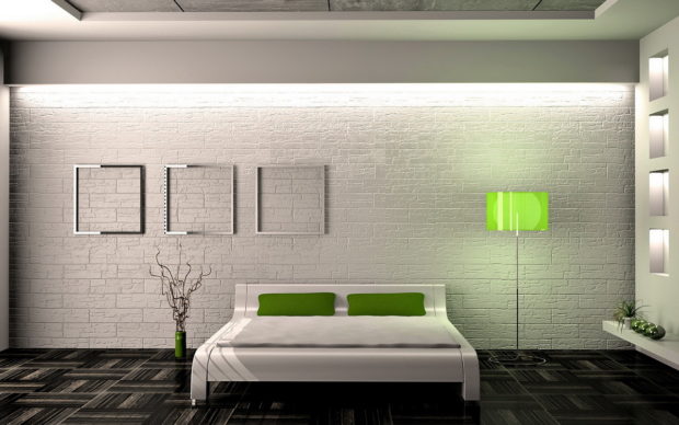
No. 3. Color spectrum
Starting to design a room in the style of minimalism, the designer chooses one or two primary colors. They will serve as the basis for the selection of finishing materials, furniture, a few textiles and lamps. Usually in a minimalistic interior. white predominatesemphasized by vivid details or in black.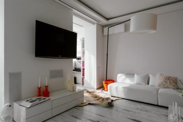
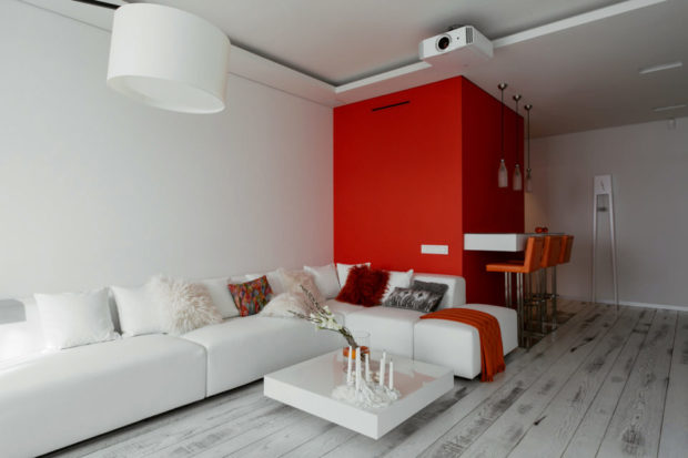
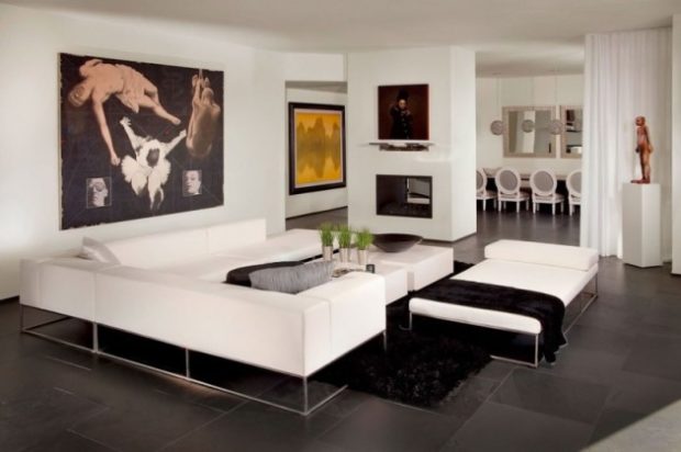
Black and white gamma - Another popular solution for minimalism. This is a game of contrasts, the perfect combination that allows you to convey the spirit and mood of the style. Often an intermediate color joins this duo - Gray. Often Gray instead of white it becomes the main shade. Combination white with gray also very common. On such a monochrome background, color details look great. Can be used blue, red, green, yellow and any other shadesbut remember the rule of three colors and moderation.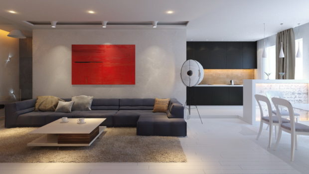
White color is perfectly combined with natural textures, and sometimes even replaced by them. Emphasis can be placed on the texture of wood, stone, sand or chrome steel.

Number 4. Decoration Materials
Here again the principle of simplicity and conciseness is included. The decoration in the room should be restrained, without drawings and pronounced texture, so that a roll of wallpaper with patterns will have to be hidden away along with a colorful carpet.
Wall decoration
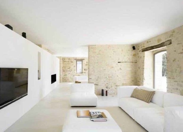
Best and easiest just paint the walls in white color. They should not attract attention. Together with white, you can use light gray, and instead of paint - plaster with a barely noticeable texture. One of the walls can be made accent. From this, the interior will not cease to be minimalistic, but will become more interesting and cozy. To highlight walls, you can use:
- paint of a different color, for example, black.Also suitable are calm turquoise, light peach and some other shades;
- wood panels, if possible, from expensive wood;
- facing brick;
- wide glossy tiles;
- glass;
- even plain wallpaper without a picture with a barely noticeable relief, and better without it at all.

Floor finish
Practical materials are chosen for flooring without a pronounced pattern. The choice is decent enough:
- parquetbut with a minimally noticeable texture. They stack it directly or deck-based - the herringbone mounting option is not suitable;
- laminate as a cheaper replacement for the parquet is also suitable, but you must be careful when choosing a color and pattern;
- linoleum subject to the above requirements can also be used;
- bulk floor, naturally monophonic, without drawings and patterns;
- porcelain tile;
- ceramic tile.
In the bedroom near the bed, in the living room in the soft zone, it is appropriate to lay carpet long-haired, but it should be monophonic, and correspond to the selected color scheme.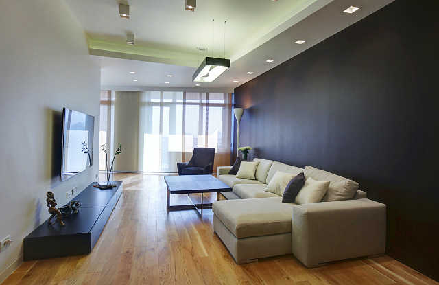
Ceiling decoration
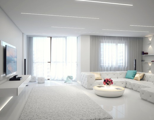
The classics of the genre - a smooth white ceiling, use matte paint for decoration. You can simplify your life and mount stretch ceilingbut also light, plain, matte. White is the preferred color, beige and sand shades are used much less often.
If the ceiling height allows, you can create a multi-level design. Stretch or false ceilings come to the rescue. The play of color is not used - only the play of light and shadow.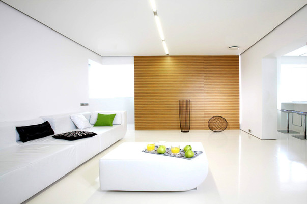
No. 5. Minimalist furniture
The principle of “less is more” most clearly manifested in the selection of furniture. Think about what items you could refuse and with a clear conscience, free yourself from them. Leave the most functional furniture in the rooms, but this does not mean that you have to sacrifice comfort. We, in fact, do not really need some things. You can easily name a couple of these. Everything else can be selected and shaped in such a way that the functionality does not suffer, and there will be plenty of free space, even in a small room.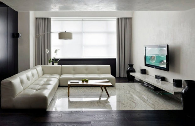
Choose furniture of the correct geometric shapes, without ornate patterns and patterns. Only chrome inserts and handles can serve as decoration, but no smooth curved lines! Preference is given to furniture that dissolves in the walls. So built in closet will become a find, as well as a kitchen set in the color of the walls.
All personal itemsnecessary appliances and stuff better hide behind the facades. A minimum number of small items should be visible. In view of this, furniture sets with closed shelves are held in high esteem. Transformer furniture is also in demand.
To the interior did not turn out too boring and monotonous, you can dilute it with chairs with bright upholstery, or juicy pillows, but remember the rule of three colors.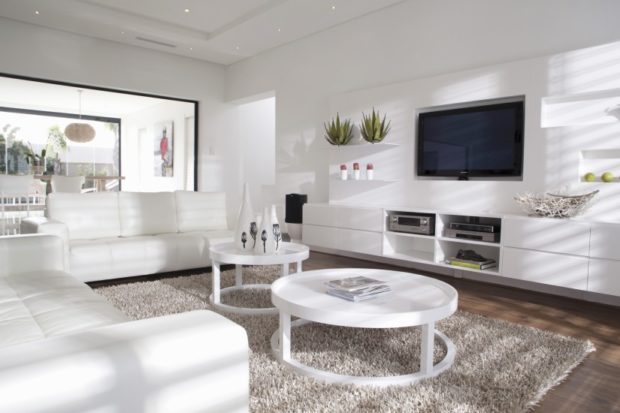
No. 6. Lighting Rules
There should be a lot of lamps in the interior in the style of minimalism. They provide lighting of various functionality: basic, working and decorative. ChandelierFor example, will be responsible for the basis of light, table lamps, floor lamps, sconces and spotlights - this is the working lighting that is required to illuminate certain areas. Decorative lighting is created thanks to LED strips. By the way, it is in minimalism that is especially honored.
Feel free to decorate the ceiling, baseboard, bottom line of furniture with hidden lighting. It creates a special atmosphere and makes the room more airy, brings a highlight to it, because minimalism is, in fact, a blank sheet on which you can create anything you want.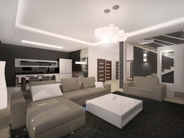
With the help of light, the room can be zoned, without partitions highlighting certain parts of the room. It is necessary to create various lighting scenarios in a room, to convey a certain mood.You can turn on a regular chandelier or spotlight, and it will be everyday lighting, or you can paint a room in blue or red using special lighting, and get a festive lighting.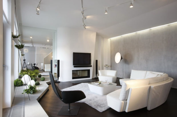
Number 7. Minimalism Textiles
Textiles in the room should be even less than furniture. It breathes more freely and more space remains. Windows can even be left without curtains, but if you live on the ground floor or worry about privacy, then choose curtains with a simple straight cut, calm, plain. Better yet, take jalousie or Japanese panels - they maximize the spirit of style and cope with their direct functions with a bang. In the bedroom, of course, you can’t do without curtains at all.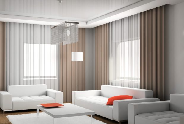
The rest of the textiles are pillows on the sofa in the living room, which can be both calm and plain, and play the role of color accents. Plaid, bedding and pillows in the bedroom choose plain. They may differ in color, but be within the limits of one color scheme.
The bedroom and living room can not do without a soft fluffy rug. White will be perfect, but other shades are allowed.

Number 8. Minimalism in the interior of different rooms
Minimalism is universal and perfect for organizing all rooms in the apartment, from the hallway to the nursery. When designing different rooms, one should be guided by the basic principles described above, but at the same time, designers recommend making corrections to the specifics of different rooms.
Minimalism style kitchen
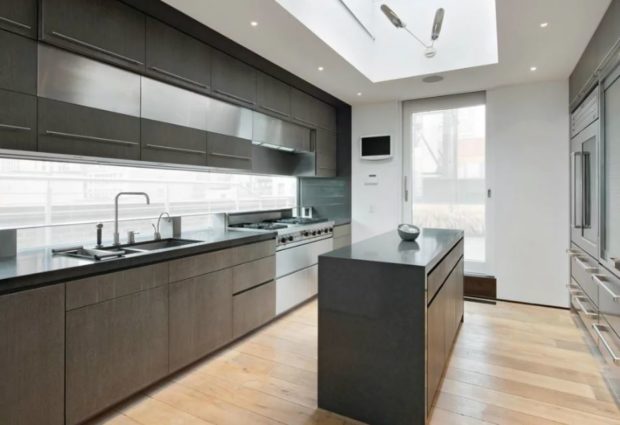
The kitchen in the style of minimalism is the dream of any housewife striving for order. In such a room, everything lies in its place, nothing clutters the work surface and dinner table. Everything looks like it's a picture of their magazine about interior design. Maintaining order in such a kitchen is simple and even pleasant.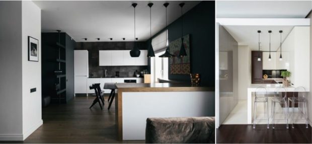
The basic principles of designing a kitchen in the style of minimalism:
- white or beige walls;
- for wall decoration choose paint, wood, decorative brick, Wet areas can be decorated with tiles, artificial stone or glass, chrome steel is allowed. For finishing the floor, a laminate or porcelain tile is suitable, tiles are used;

- the furniture has a strict shape, headset It dissolves against the background of walls, but may be of a different shade. Gray and brown furniture will do, even spacious black headsets are used in spacious kitchens. Headsets made in contrasting colors also look good: white top, dark bottom;
- all domestic appliances are built-in;
- dishes, kitchen utensils and small household appliances, after completing the culinary processes, hide in their places;
- all bottles, ladles, cans and other items that are considered an integral decoration in the style of provence or bohomust be hidden. Minimalism in the kitchen is an almost complete lack of accessories.


Minimalism style living room
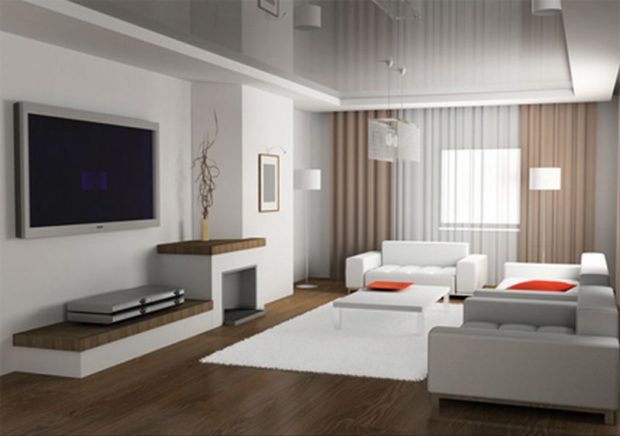
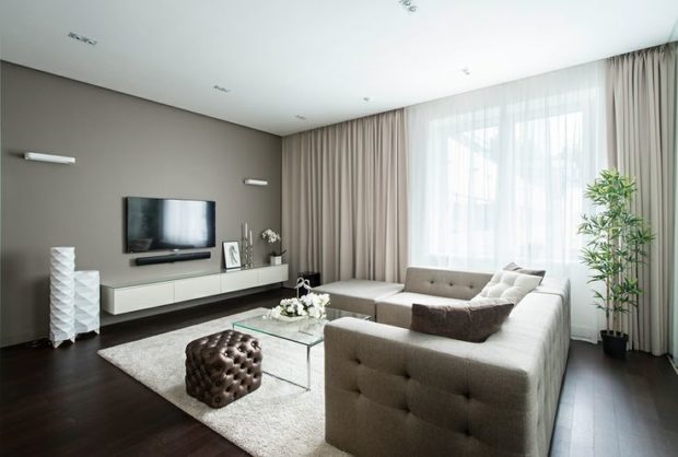
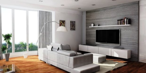
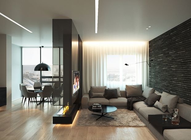
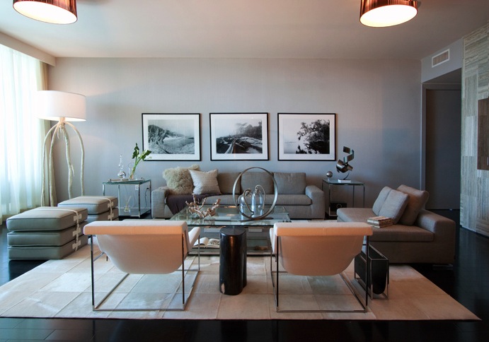
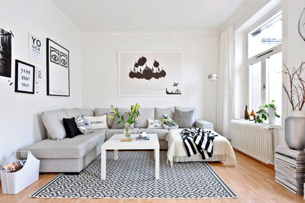
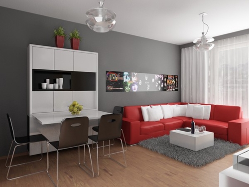
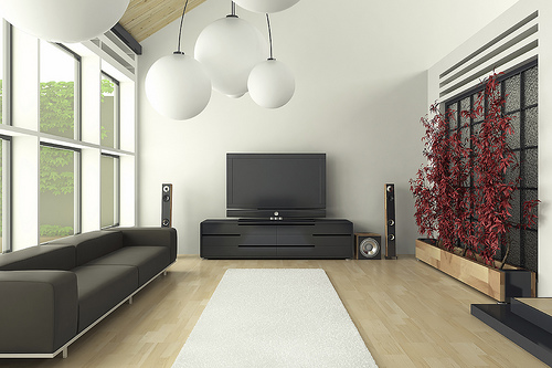
Genius in simplicity. Such a conclusion can be drawn by looking at a properly designed living room in the style of minimalism. Its key features:
- a lot of light and little furniture;
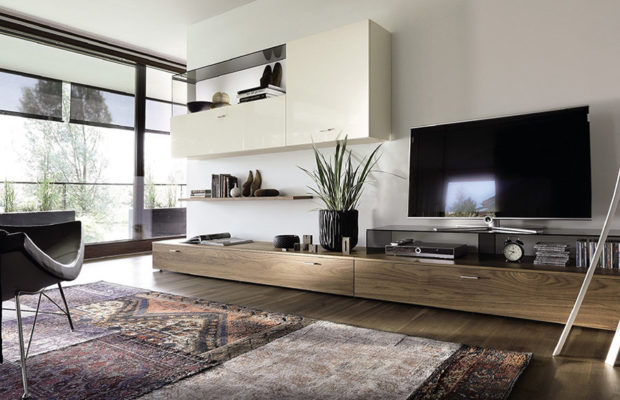
- objects of technology do not attract attention, but become part of other objects and planes. You can hang the TV on the wall, and place the air conditioner as unnoticed as possible. Also try to do something with the wires - they should not be evident;

- flat objects with a reflective surface are welcome. It can be mirrors, slightly glossy or glass surfaces of cabinet furniture;
- sofa can be decorated with several colored pillows;

- the living room cannot do without accessories, but try not to use small decor. Every thing should be clearly visible;
- coffee table can be transparent (glass or plastic);
- furniture and all accessories are subject to the rule of strict forms.


Minimalism style bedroom
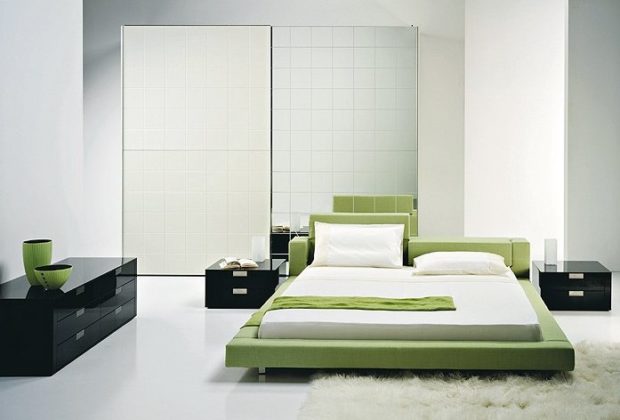
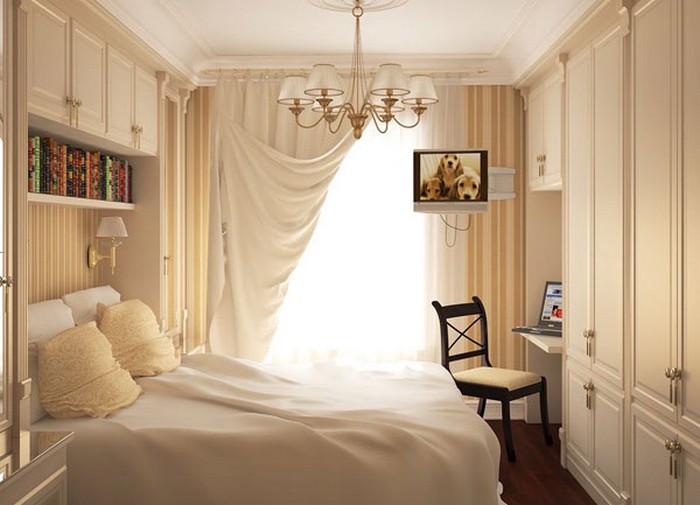
A bedroom in the style of minimalism is cosiness and spaciousness, and in order to achieve this they are guided by the following principles:
- walls can be painted in a warm color, but white is still a win-win option;
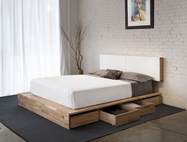
- bed choose wide, simple. Low beds are also popular. The bottom edge of the bed can be highlighted to make the room more airy;

- all things are sorted out by bedside tables, wardrobes and walk-in closets. Beds with extra storage space are at a premium. It is possible to equip podium, and store things in it. It’s better not to leave anything in sight;
- windows are decorated with simple curtains, blinds or roman blinds;
- as a decor, a large flower, a black and white picture, Wall Clock. Wood and chrome steel accessories can also be used;
- a small rug is welcome near the bed.


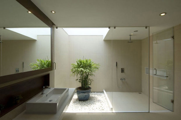
Minimalism style bathroom
The rules for designing a bathroom in the style of minimalism perfectly coincide with the limitations that appear to the owners small bathrooms. Follow these rules:
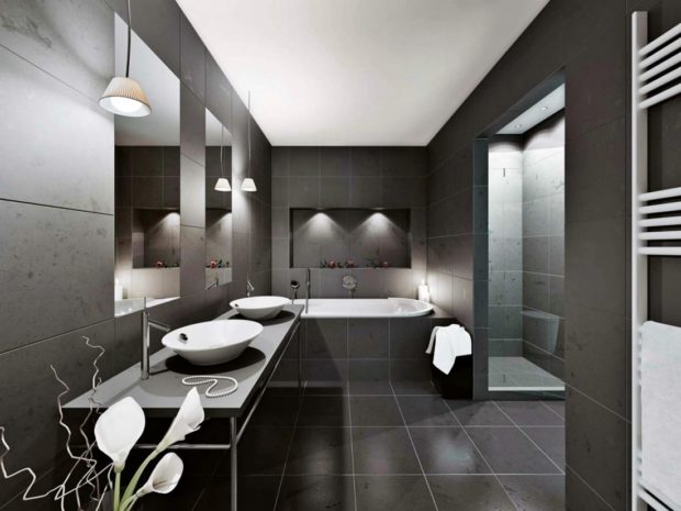
- Choose two primary colors. It can be black and white, brown and beige, but not red and blue - minimalism suggests restrained calm shades;
- the floor is best tiled. The walls can be partially tiled, partially painted or plastered. Everything is very simple and concise. No bas-reliefs, gilding, images of butterflies, etc .;

- all necessary bath accessories should be stored behind closed shelves and doors. It is not difficult to get them out and put them back after use, but in the bathroom there will always be complete order;
- metal chrome mounts can be used for mirrors and towels. The same chrome elements can be used in accessories (paper holder, brush, container for liquid soap, etc.);

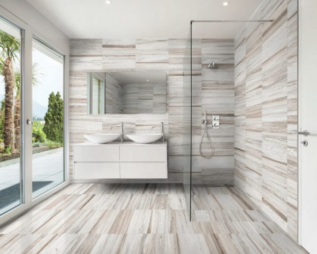
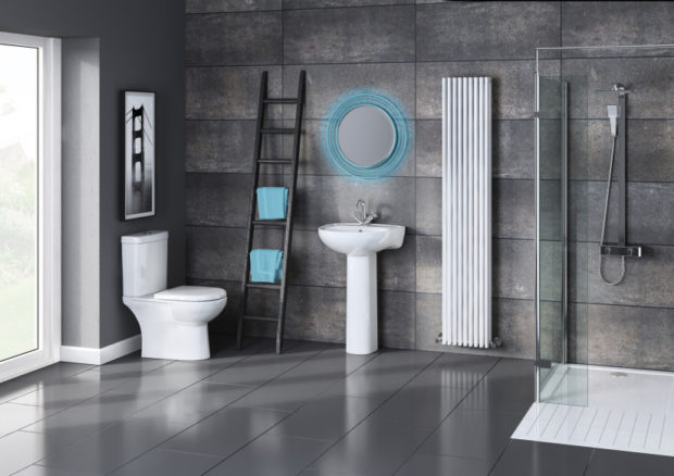
- an abundance of glass. Doors shower stall completely made of clear glass. Beautiful, and visually more free space remains;
- in addition to chrome and glass, they use white limestone and marble, as well as brick tiles.


Minimalism style hallway
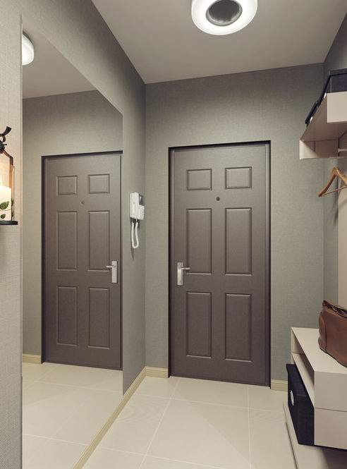
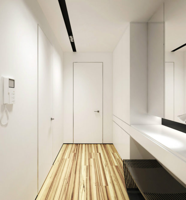
The hallway is decorated in bright colors and use a minimum of furniture. A small wardrobe is enough shoe racksif it does not have a shoe storage compartment. Reflecting surfaces are respected, so the cabinet can be chosen with a mirrored door. An alternative is to attach the self mirror without a frame on one of the walls, and take the cabinet with a slightly glossy surface. The entrance hall should be light, but they do not focus on the lamps. They are here purely in order to fulfill their direct function, so that they can be as simple as possible.
Minimalist style nursery
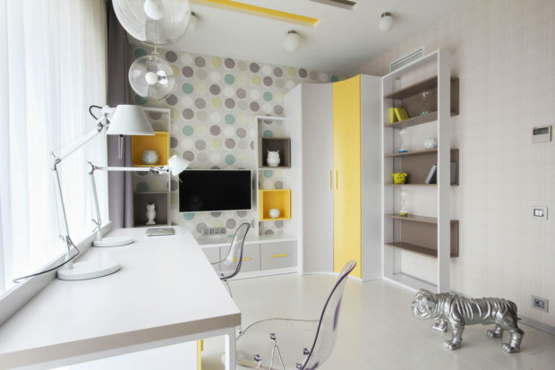
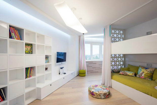
Minimalism involves leaving a lot of free space, and children will appreciate it when they play. The style is perfect when decorating a room for several kids. You can safely use transforming furniture and rolling beds - this is in the spirit of style.
Minimalism in a nursery can be a little brighter than in other rooms. Here, against a monochrome background, bright pieces of furniture feel great. Part of the walls can be decorated in some juicy shade, so that the child would not be bored.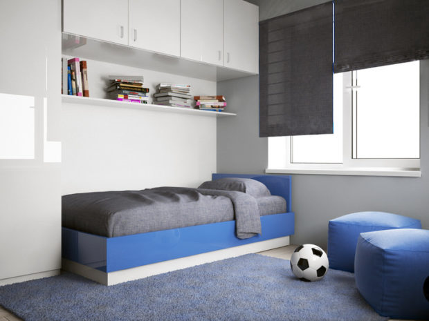
In conclusion
Finally, we note that decor minimalism is not so much. Large wall clocks, interesting paintings, vases and mirrors are best suited for this role, but some other elements will look appropriate. Minimalism is perfect for owners of small apartments, housing in Khrushchev, studio apartments, as well as those who like to have no abundance of unnecessary items in the apartment.

