10 kitchen zoning tips
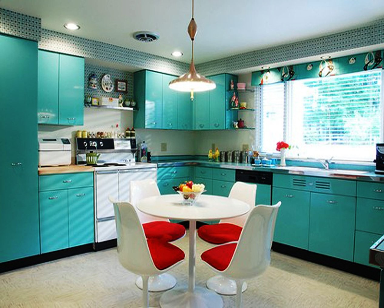
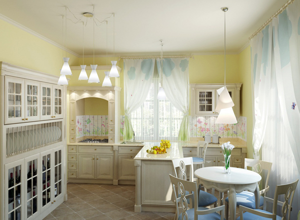
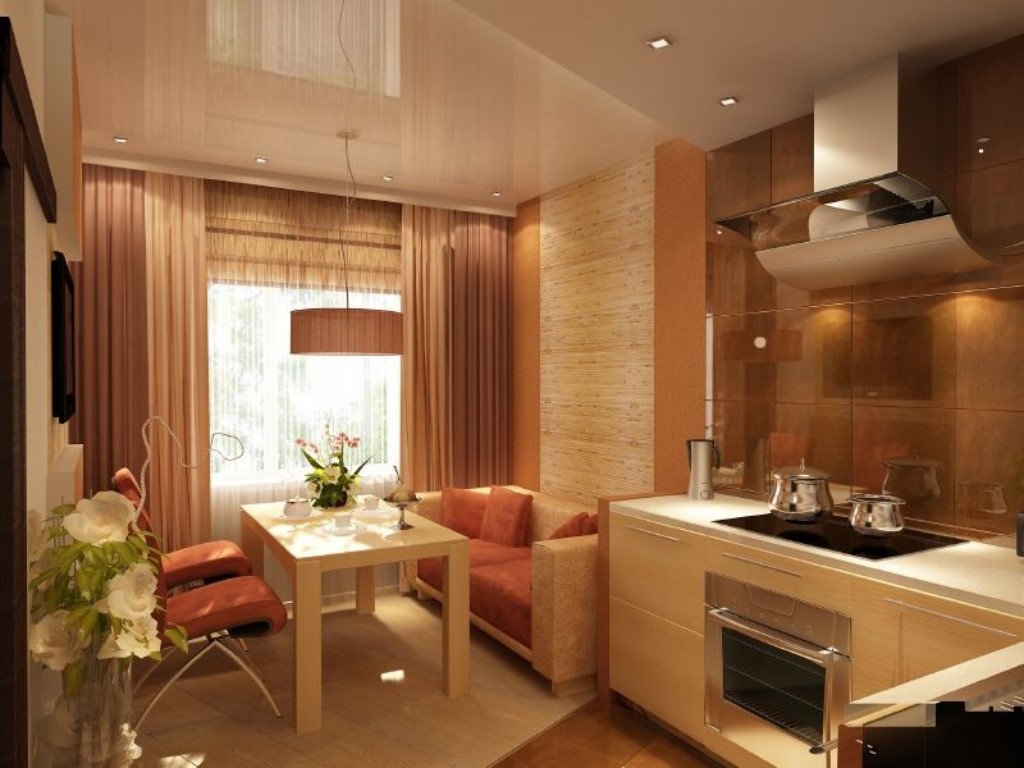
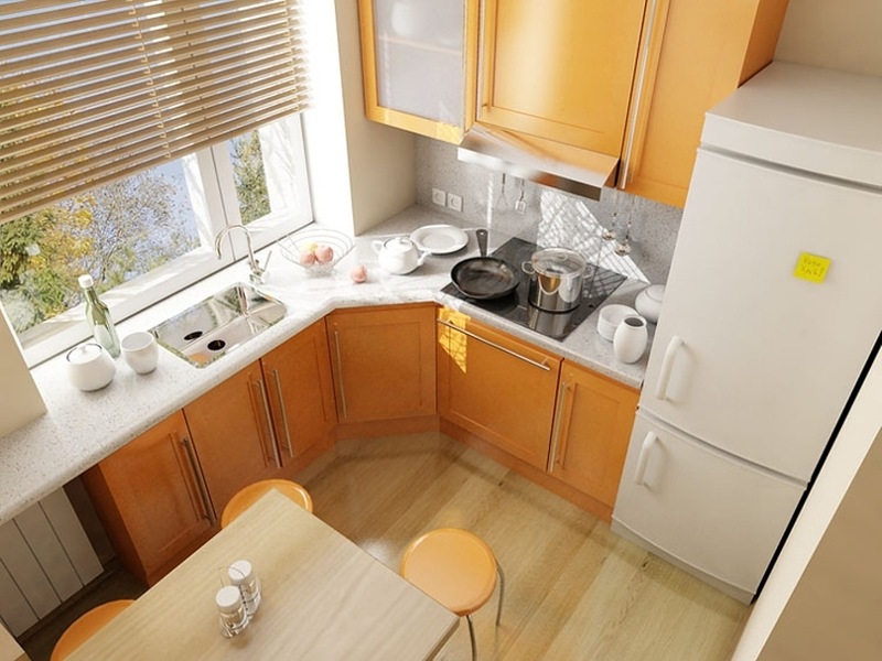
Kitchenespecially if she is small, - This is one of the most difficult premises for the proper organization of space. After all, here you need to allocate a place for cooking, the so-called working area, as well as space for family dinners, a dining area. To be in the kitchen was cozy and comfortable, it is better to distinguish between these two zones, and you can do this in a huge number of ways. Some of them are suitable for ordinary kitchens, while others are used for zoning kitchen-living rooms. Consider the most popular and interesting options.
No. 1. Lighting Zoning
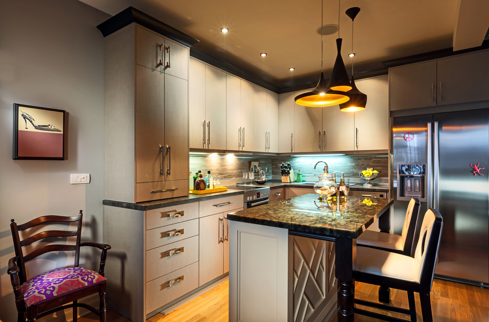
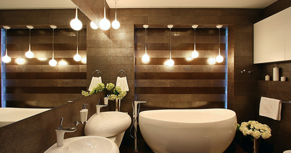
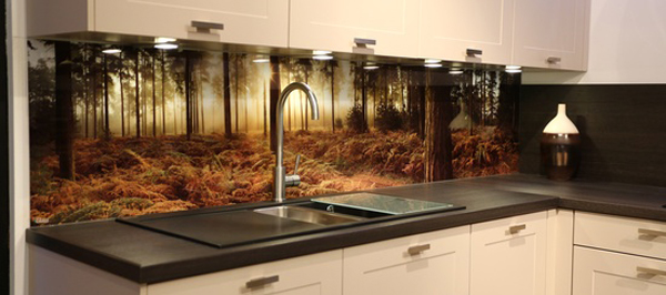
Lighting - One of the most effective ways of zoning the space in the kitchen. In the working area Adequate bright lighting is needed to conveniently handle cooking. Here, the lamps built into the cabinets that shine directly on the work surface showed themselves best. It’s also nice to equip the area above washing, and above the stove use a hood with a backlight.
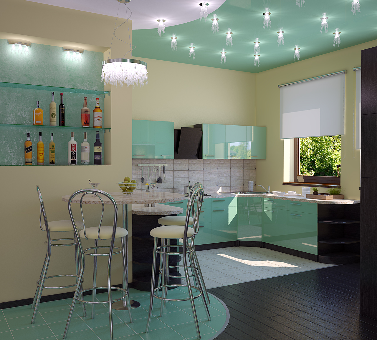
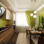
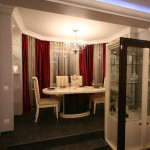
Over the dining area you need to create soft and comfortable lighting, conducive to pleasant family gatherings. Better placed dinner table near the window to make the best use of natural light. In terms of artificial lighting is perfect ceiling light height-adjustable, and it should not hang in the center of the kitchen, but directly above the table. You can provide several such small lamps. If this option is not to your liking, then you can use Wall lights, and if the area of the kitchen allows, even outdoor. Also, the dining area can be distinguished by spotlights built into the ceiling, and tiered ceiling - In general, a great idea, because it visually divides the space into zones.
With all this, do not forget about the need general lighting for the kitchenThat will combine the zones and be used when bright working lighting is unnecessary.
No. 2. Wall zoning
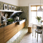
If we are talking about a small kitchen, then the easiest way to divide it into zones is to use various Decoration Materials like for wallsso and for the floor. So, in the working area of the wall is best tiled, and use a warmer and more cozy material near the dining table: washable wallpaper, decorative plaster or paint of a certain shade. The transition between different materials should be noticeable, but it should not be too contrast, because the room should be perceived as integral and harmonious, but at the same time with several zones highlighted.
No. 3. Flooring zoning
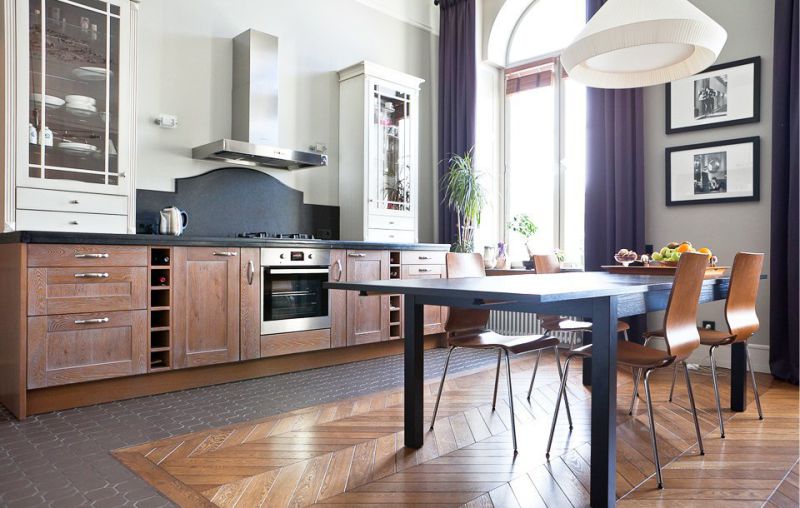
As for flooring, then it can also be used to distinguish zones. At all for zoning it is better to combine several methods at once, and then you can create a full-fledged work and dining space. In the kitchen you can use two different floor coverings: in the area car washwork surface slabs and refrigerator - tiles or porcelain tiles, for example, and in the rest of the kitchen, which is intended for relaxation, use laminate or linoleumto make the space cozy.Some designers advise dividing the space into zones by using the same material for finishing the floor, but in a different shade, which also looks interesting.
Number 4. Use of color in zoning
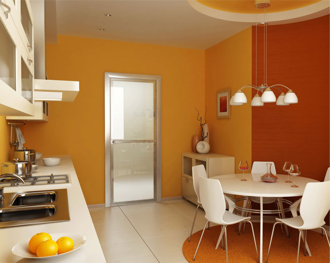
Different zones can be finished not only with different materials, but also have different color scheme. In this regard, it is important not to overdo it and find a middle ground: the working and dining areas should be separated from each other, but not be contrasting. Better work within the same color using its shades: Thus, it will be possible to visually highlight the zones, but at the same time maintain harmony.
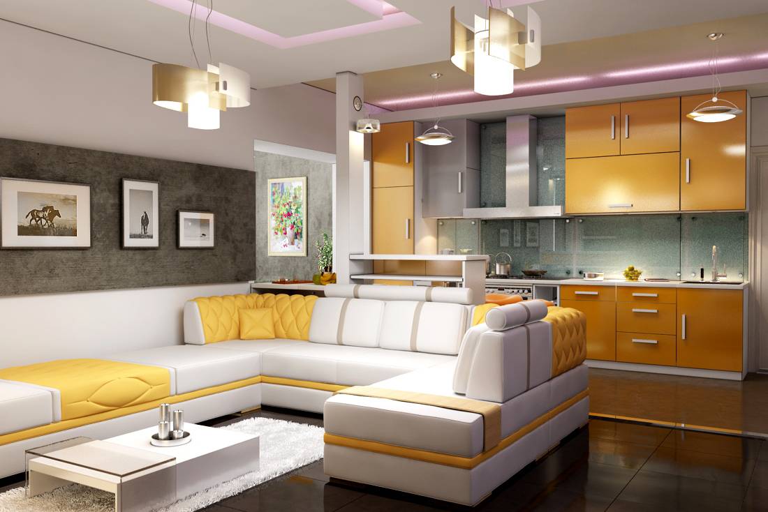
It’s worth making an amendment. When it comes to the kitchen-living room, then in this case it is appropriate to use even contrasting shades, but you still need to act carefully. If you are not sure about your own decision, then it is better to use shades of the same color or resort to the help of a designer. The same goes for of furniture: The overall style should be observed, but the furniture should not be the same in the working and dining areas.
No. 5 Podium
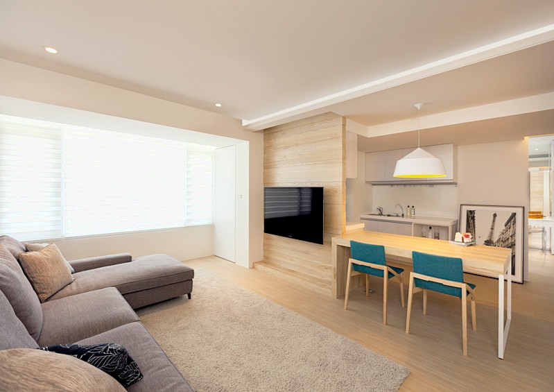
If the kitchen is large enough or you equip the kitchen-living roomthen you can use not only visual zoning, but also quite physical. It could be, for example, podiumon which the dining area will be located. This is an excellent design technique, which allows you to get additional storage space, but it’s worth considering how convenient it will be in your particular case: perhaps there are elderly people and small children in the family who find this podium difficult. The working area is sometimes isolated by a podium, but this is often explained by the need to hide communications. Additional podium lighting will bring the final touch to the zoning of the room, and at the same time will allow you to create an unusual interior.
No. 6. Partitions, arches, screens
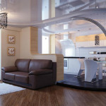
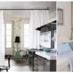
You can create between the kitchen and living area a small plasterboard partitionwhich will take the form arches or half arches. Can be used partition made of wood and glass: due to its transparency, it will not reduce the room, but it will clearly divide it into zones. As partitions, you can even use screens and fabric, because these are light and mobile materials that perfectly copes with the role of dividing rooms when necessary, and are easily cleaned if desired.
Can be used sliding partitionsthat are perfect for spacious kitchens or kitchens combined with the living room. During cooking, the partitions can be closed so that odors do not spread, and then opened, visually combining all the zones.
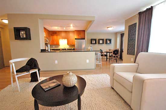
Another option is barrier or semi-partition with a small height. Some kitchen furniture can also be hidden behind it, and the eating area in this case will be perfectly separated.
Number 7. Bar counter
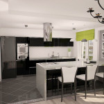
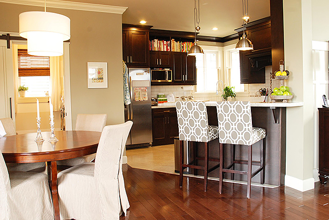
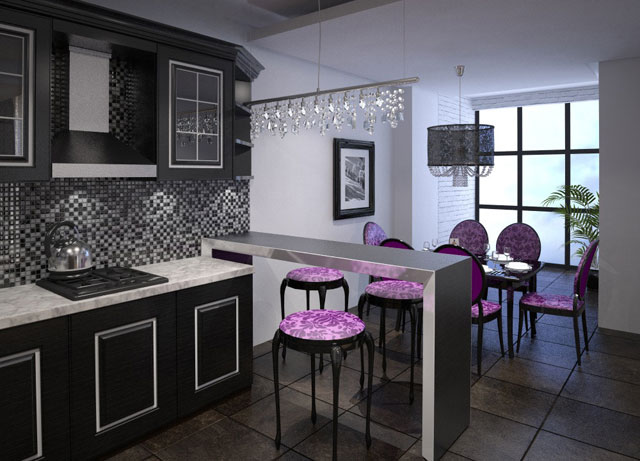
Today bar counter - one of the most popular ways to divide the space, and it can be used both in ordinary kitchens and in kitchens-living rooms. Naturally, this option is not for the smallest kitchens, but for many more or less spacious rooms it is very suitable.
Bar counter - multifunctional item. She not only copes with the division of space, but also transforms the interior, making it modern and stylish. Moreover, this is also an additional place for a snack and even a full meal. In some cases, the bar can even become a full-fledged place for lunch and dinner, unless, of course, we are talking about a small family.
Number 8. Fancy ways to zone space
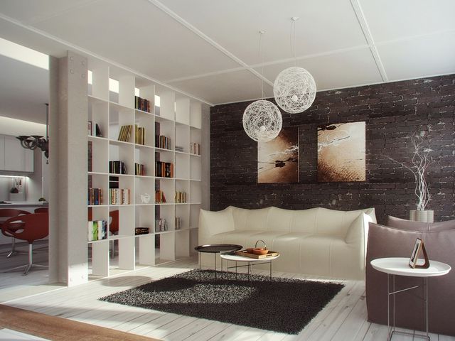
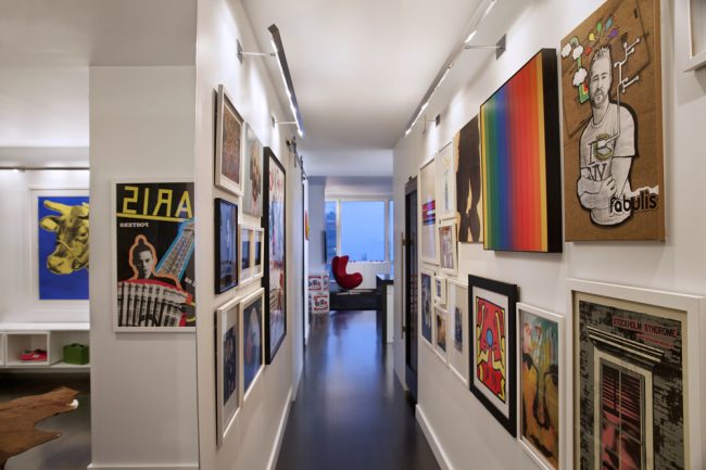
The need to isolate in a small room several zones of different functionality at once pushes people to bold decisions. So, two zones can be divided aquarium or shelf systemon which to arrange flowers, kitchen utensils, souvenirs and other items. The dining area can be distinguished photographs or paintings, interesting photo wallpaper etc. In search of the best solution for yourself, you need to turn on your imagination, and then in the end you can get a beautiful and unique interior.
No. 9. Is it worth it to combine the kitchen with the living room?
A similar solution is very popular today. Combining the kitchen with the living room, you get many advantages:
- increase in usable space, because there are no more walls that took away space and light;
- opportunity for the mistress look after the childrenwho are in the living room, watch TV, and indeed be with the whole family, not looking up from the cooking process. A separate TV in the kitchen is also not needed;
- when guests are in the house, cover on table very simple, because all the dishes and dishes can be moved much faster and spend less on this;
- opportunity create unique and stylish interior.
But the desire to make space bigger and brighter requires some victims. Smells will spread into the living room area, in the kitchen you will have to follow the order twice as hard, which requires open space. Some also complain about the lack of cozy privacy during rest or eating, but in the latter, zoning helps.
But still combining the kitchen and the living room is only better if you have a large apartment, and each member of the family has a separate room. If the area of the kitchen and living room is small, then such a solution would also be most welcome. What methods of zoning, in addition to those described above, are suitable in this case?
No. 10. Furniture zoning
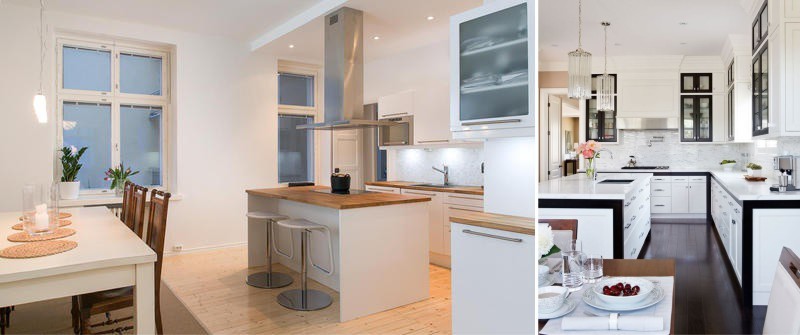
It is very simple to separate the work, dining and rest areas with the help of furniture. The most affordable option is dinner table, which is placed on the border of the zones: fulfilling its direct function, it becomes an explicit separator of space. To enhance the effect, around it you can put chairs of the same style, but different colors, and their shade should correspond to the selected color scheme for the kitchen area and living room.
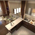
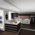
If the area allows, zoning can be used kitchen island. This place where the sink is located can be a stove, a lot of drawers and storage places, as well as a working area. It is important that around the island to the walls or nearest furniture there was still free space.
To separate the recreation area and the working area, you can use sofaby turning his back to the working area. At the same time, not a centimeter of usable area is lost, and visually the space is divided no worse than if there were walls between the zones. Naturally, it is better not to choose the easily soiled upholstery for the sofa.
For large kitchens and combined kitchens for zoning, you can use cupboard. This is a great place to store, the back wall of which can be finished with murals, or hang some pictures to transform the dining area.
In conclusion
The function of any zoning is to highlight comfortable areas in one room in which a person will feel comfortable. Zoning is necessary not only for large kitchens and kitchens combined with living rooms, but also for any, even the smallest, space, otherwise different zones will mix together, turning the kitchen into chaos. In order to highlight areas in the kitchen, you can use several different methods, but it is better to combine them, and then even the tiniest kitchen It will turn into a comfortable place for cooking and family gatherings.










Well done site designers and those who were responsible for filling the site.
A lot of useful up-to-date information. Convenient links to pages.
when I first got to the site, then I followed the links that are meaningfully linked. Which is actually a rarity.
Regards yu lo
ps here only in some places the font is faded, poorly readable. Here in particular in this letter.