One-room Khrushchev design: 16 tips + photos
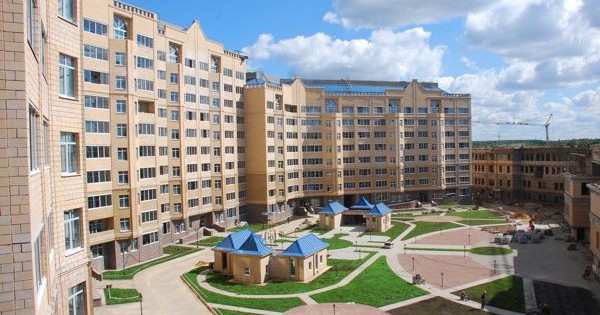
At the time of Khrushchev, the big problem was the housing issue, which the "skillful" builders solved with the help of the construction of many houses, most often panel ones, with apartments of a very modest footage. By and large, a way out of the situation was found, people acquired their own housing, and the grievances were over. But! No one really thought about the fact that the size and layout of such apartments, especially one-room ones, left much to be desired. ABOUT shortcomings of small-sized Khrushchev one can speak for a really long time, but, despite this, this type of property has not yet lost its popularity. The reason is very simple - the low cost of apartments, especially compared to new buildings. Therefore, instead of reminding yourself once again about what a dull and nondescript interior you have in your apartment, you need to radically revise design of one-room Khrushchev and try to transform it. We collected life hacks for the selection of finishing materials, furniture, colors, lighting, as well as redevelopment options, zoning methods and a lot of photos.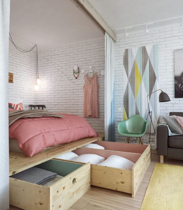
1. Khrushchev. Typical layouts
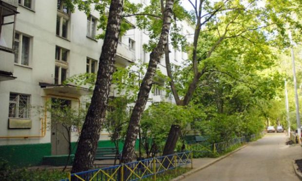
Mass construction of the Khrushchev began in 1958 and lasted until 1985. At that time, thousands of families received their own housing in 4-5-storey panel and brick houses. The rooms were very small and, in most cases, aisles, the corridors were narrow and dark, and the bathrooms were immediately shared. The ceiling height was 2.48 m, in rare cases - 2.7 m. The area of one-room apartments did not exceed 29-33 sq.m. of which 5.8-6.2 meters were allocated for the kitchen, from 15.9 to 20.7 meters - for the living room. The rest of the square was occupied by a corridor and a bathroom. The dimensions of the premises depended on the year of construction and series and had the following typical layout: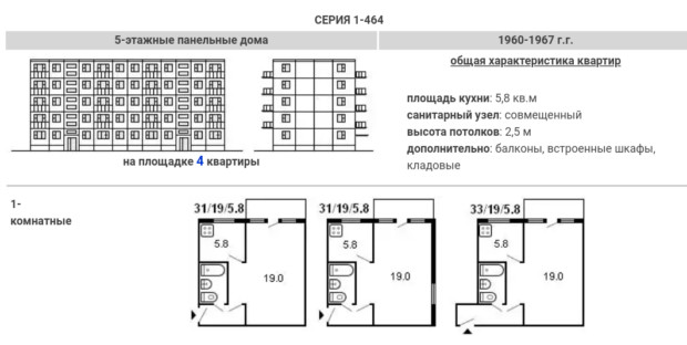
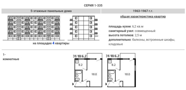
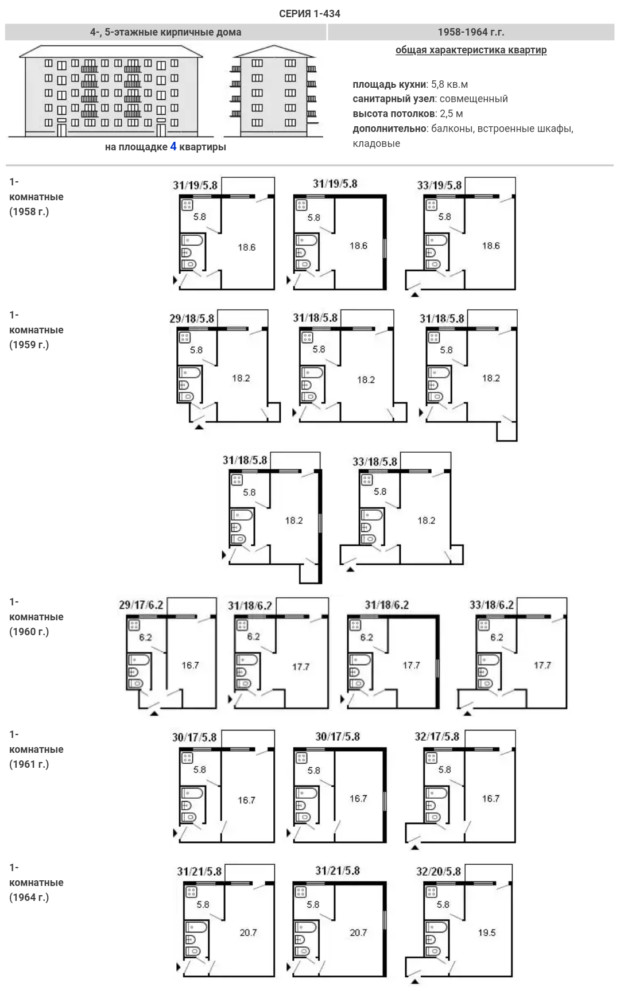
It is noteworthy that almost all odnushki had a balcony and almost the same arrangement of rooms. Before you get started to some radical measures, you must clearly know:
- The exact number of residents. After all, it is one thing to carry out work on organizing comfortable living for one person, and quite another for a young family with a child. The requirements will be radically different, the division of the area will be completely different;
- Without what functional zones you definitely cannot live. We are talking about such "rooms" as a study or a full isolated bedroom. After all, some people easily use the sofa in the living room for daily sleep and feel absolutely normal at the same time, while for others such openness is depressing;
The volume of work that we have to plan, the need for demolition of interior partitions, or, conversely, the construction of additional ones, will depend on the two factors listed above. Do not wonder. But really not all designers recommend doing from odnushki studio apartment. In order for the housing to meet all the requirements of the owners, sometimes full-fledged blind partitions are made of light materials - drywall or aerated concrete. Therefore, it is preliminary recommended to make a list of the required items that you want to have. It can be anything - a sink opposite the window in the kitchen, a shelving for a personal library, household appliances that you cannot refuse, etc. Based on this list, you need to plan the interior design and redistribute the space between the zones.
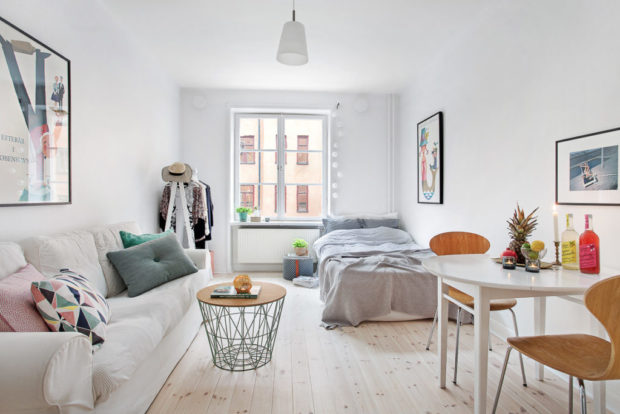
2. Radical measures to expand space
It is not always possible to visually expand the space, using only the well-known technique “a spacious apartment - a white apartment”. In addition, not everyone is comfortable surrounded by white walls and white furniture and all white, despite the fact that this color has many beautiful shades. therefore physical methods the increase in usable area still prevails in most cases. 
There are only two possible options:
- Demolition of partitions. The most pleasant moment is that all the restrooms in the one-room Khrushchevs are not load-bearing. In very rare cases, this is not so. Therefore, you have complete freedom of action, and you do not risk collapsing the whole building due to inept redevelopment. The absence of partitions will instantly make the home more spacious and bright and open up new possibilities for arranging furniture and dividing it into necessary zones. But do not forget that any work must be legalized by the relevant authorities. Indeed, without a new technical passport, you will not be able to sell redeveloped housing in the future;

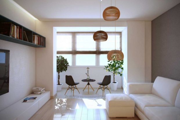
- Combination with a balcony. In the first paragraph, we emphasized that almost all odnushki have a balcony for a reason. After all, these are invaluable additional meters to the total area of the room. Yes, you are unlikely to be able to increase the size of the room by more than 4 square meters, but you must admit, with a total area of 30 squares - this is a real bonus that you definitely need to use! The space that appears can be used as you like, depending on whether it adjoins the kitchen or the living room. In order to make this place comfortable, work should be done on insulating all its surfaceth and set high-quality double-glazed windows. By the way, such a combination also applies to redevelopment and requires all permissive documents. Especially if you plan panoramic glazing.

Yes, you will have to visit many institutions before you agree on all the work, but the result will be worth it. And if you ask the construction organizations that will develop the design project for help, in most cases they will take upon themselves all the permissions, which will significantly speed up the start of work and save your nerves. Sure good think before how to combine the kitchen with the living room. After all, firstly, if the room has a gas stove, then there must be a door. And secondly, if you use the kitchen often and for its intended purpose, then this may not be very convenient. With characteristic odors will help to cope. powerful hoodbut with the accompanying sounds - no.
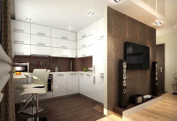
3. Ways of zoning the combined space
After all the extra partitions that prevented breathing are torn down, it is time to correctly divide the large rectangle into functional zones. In such small spaces it is necessary to choose such zoning methodswhich will not take up much space. Therefore, most often used non physical methods:
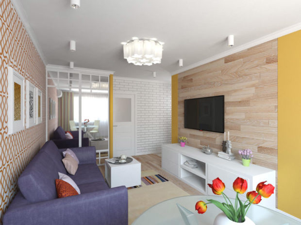
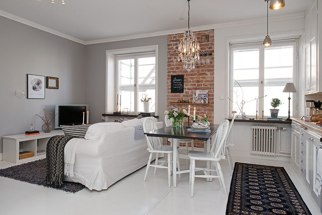
- Zoning by using different finishing materials. Separation of one zone from another can be exclusively visual. The desired effect will help achieve wall and floor coverings, which will have to differ in a particular area in color, texture or performance.For example, in the living room it will be an imitation of brickwork, and in the recreation area - wallpaper or paint. The entrance hall has floor tiles, and in the living room laminate etc.;
- Light zoning. This option perfectly copes with its task, it looks beautiful and interesting and fills the apartment with light, which makes it visually more spacious. Each zone should have its own light fixture. What specific form it will be presented is not important, the main thing is that you can fully use it independently of the others. For example, in the living room you can hang full chandelier above the sofa, in the area acting as a study, set a table lamp. In the recreation area, mount several diode lamps in the ceiling or hang a sconce. Also often used floor lamps, diode tapespotlights, the luminous flux of which can be directed to the right place;

- Mobile screens - A great way to create a secluded space. And as needed, they are easy to fold and put away in a secluded place;
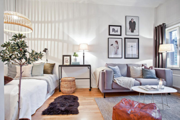
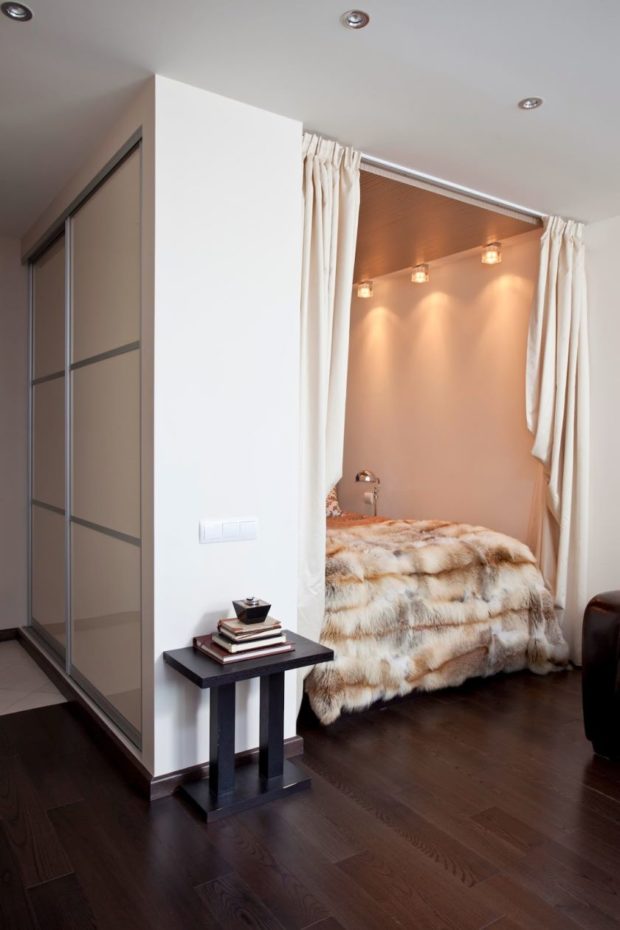
- Textile zoning - Another beautiful way that does not require much space. Separating a sleeping place about a common space is very simple by setting it on the border cornice and hanging a beautiful curtain. Material density selected at your discretion. If you want complete insulation, choose a dense, lightproof fabric. But do not use too dark shades. If you only need to indicate the border, both filament curtains and light tulle will do;

- Transparent glass or plastic partitions also do an excellent job;
In order not to sacrifice the door to the kitchen, but still be able to expand the space, install wide sliding doors. When you are not busy cooking, they can easily be shifted sides;
- Bubble panels or narrow aquariums, although they occupy some space, but they look very impressive and unusual;
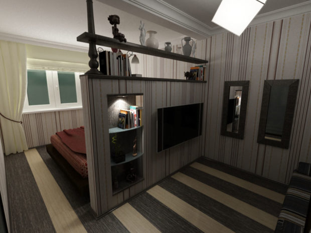
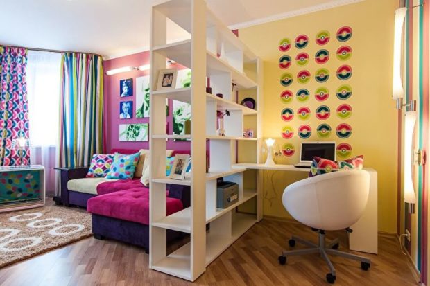
- The most dimensional way - zoning with the help of furniture, sometimes it is just a necessity. But do not forget that the back wall of the wardrobe can simultaneously be a place to place wall shelves, full-length mirrors, or just be glued with wallpaper and serve as a full-fledged partition.
Before you set the boundaries, you need to decide how many meters do you need for this or that room. For example, 1-2 square meters are enough for a study, 6-8 for a bedroom, no more than 6 for a kitchen, from 8 to 10 for a children’s room, since in addition to a place for rest, there should be a place for games and a desk. The rest remains under the living room. Most often, a balcony is reserved for the organization of one or two workplaces.
4. Examples of successful redevelopment of the Khrushchev
In this section we will give some examples of stunning and functional layouts of one-room Khrushchevs, with an area of 30 square meters, which were implemented in reality. When planning, all the requirements and wishes of the owners were taken into account, and the dimensions of the furniture, the thickness of the partitions and aisles, was calculated up to a centimeter. Otherwise, it would simply not have been possible to bring furniture into the room.
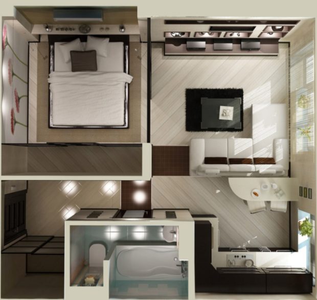
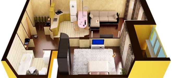
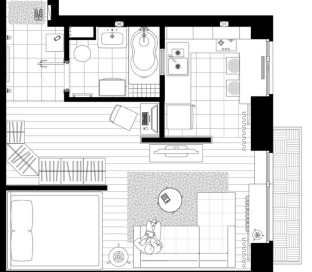
- Example No. 1. During the redevelopment of this dwelling, at first all the partitions were demolished, and then new ones were erected. The right thickness and in the right places. The kitchen was still combined with the living room, at the border bar counter and chairssince the table had to be sacrificed. This made it possible to fit a sofa and small nightstands on the sides. It is worth noting that the kitchen area is only 5 square meters. The bedroom turned out to be quite spacious and could fit bed and wardrobe. It was possible to maintain a spacious corridor, where a niche was organized for closet. Thus, the storage space in the apartment is more than enough. The area of the bathroom is only 3 sq.m. Therefore, they preferred the standard bath shower stall, and the sink was installed above the washing machine. Well, and what you do not have a full kopeck piece?

- Example No. 2. This layout is implemented on an area of 31 square meters in a corner apartment. In this embodiment, the kitchen remained isolated from the rest of the premises. In addition, a partition was added in the living room, which allowed to separate the sleeping area and widened the opening between the corridor and the living room. The door frame was dismantled, which allowed to visually expand the room. Due to the fact that the apartment is angular, both in the living room and in the bedroom there is a window opening, which makes them full, separate rooms. The bedroom area is 7 sq.m., the living room is 9 sq.m. At the same time, both rooms include one small workplace. Please note that all furniture is mobile and functional.
 The desk is equipped with wheels, which allows you to move it to the center of the living room when guests arrive. The capacious case is presented by an angular model. And the most pleasant thing is that the bathroom managed to fit a full rectangular bathtub due to the fact that narrow plumbing was used and wall hung toilet the smallest size, and the washing machine was suspended above the toilet;
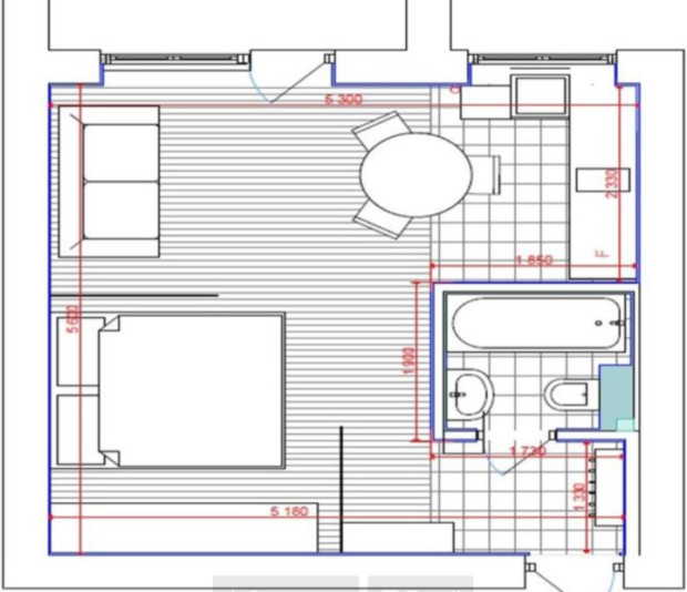
- Example No. 3. The area of this apartment is 29 square meters. In this case, every centimeter of space was used to the maximum. Part of the partitions was dismantled, niche equipped to accommodate the bed and moved the entrance to the kitchen. Where there used to be a door to the kitchen, now there is a small workplace. The kitchen is 5 sq.m. There is a large number of built-in equipment. It was possible to fit it due to the fact that the narrowest built-in models were chosen, and the gas stove was replaced by a two-burner hob. To have a full working area, countertop extended and opposite the window. The bedroom and living room, in fact, make up one room. But isolation of a berth occurs due to a sliding screen. The diagram shows that a large corner wardrobe fits in the hallway. Additional storage space is provided by a niche in the sofa and a large box under the bed mattress with a lifting mechanism, as well as wall shelves;

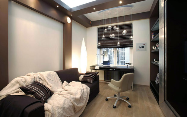
- Example No. 4. This example is the redevelopment of an apartment of 30 sq.m. interesting in that a glass partition was used to isolate the bed.
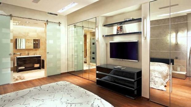
 In addition, it is equipped with blackout curtains, which even in daylight provide complete dimming. In the bedroom under the wall there is a large wardrobe with glass facades. This technique makes it possible to create a perspective that visually increases space. Another smaller closet is located in the hallway. The living room is combined with the kitchen, and at the border there is a dining group. Windowsill in the kitchen was raised to a level with a countertop and is its continuation. The entrance to the bathroom was moved, thanks to which it was possible to compactly place all the necessary, and even a full bath. The washing machine in this case is also suspended using special mounts over the toilet. Agree, after such actions it is already difficult to call the apartment Khrushchev. Such housing is maximally adapted to the needs of the owners, functionally and comfortably.
5. What style of interior is better to choose
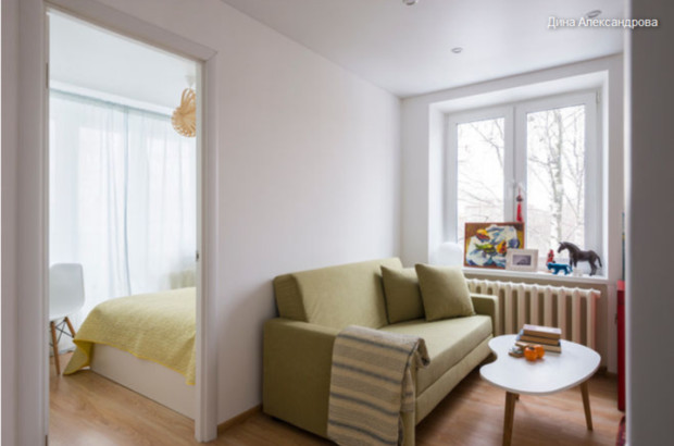
To claim that some specific style is the most recommended for the interior of a one-room Khrushchev, will be wrong. All styles are equally suitable. for the design of both large and small rooms. Of course, modern trends, which are distinguished by their simplicity, restraint and conciseness, will achieve the best results. Such interiors are endowed with a special spaciousness, a sense of freedom, filled with light and contain only the essentials. But what to do for those who prefer classic or cute provence? And if there is no clear favorite at all?

To create a harmonious space, you should stick to several recommendations:
- If you like the characteristic features of several styles at once, do not deny yourself the pleasure of creating a unique interior.The main thing is that the styles are in harmony with each other and do not create inappropriate contrasts;
- Lovers hopscotch do not give up your preferences. Given that such royal styles are best revealed in large areas, and in small rooms create a feeling of crowding, use only certain characteristic fragments. For example, focus on chic, expensive textiles. This feature is characteristic of both classics, and Baroque and Renaissance. Add a little stucco molding on the corners of the ceiling or “gilt” a beautiful frame around the mirror. Use appropriate finishing materials, beautiful fabric shades for floor lamps and table lamps. And a luxurious but spacious interior is provided for you;
- Adherents of ethnic styles just need to bring recognizable elements of decor to the interior. For example, the Egyptian style is not without statuettes sphinxes and pyramids, Chinese - without hieroglyphs and dragons, Japanese - without a graceful sakura branch, etc. and of course you need to adhere to a suitable color scheme.

6. Tips for choosing finishing materials
Various prohibitions on the use of certain decorative materials are also a big mistake. Depending on the chosen style can use all - and plastic panels and paper wallpaper. Still stand out too much, because in small roomsthe simpler the better.
- For wall decoration try to use plain materials or those that have a natural texture. A suitable solution would be to apply photo wallpaper. A well-chosen drawing with a perspective will visually enlarge the room. Various landscapes, on which there is a path, as if leading away into the distance, are perfect. The advantage of such canvases is that they rarely bother, unlike abstraction or a view of the night city. Try to choose wallpapers on which there will not be too large a picture. Do not forget about mirrors or mirror panels;

- Because the ceilings in Khrushchev lownot worth building layered designs. They visually lower it even lower. A simple white ceiling with soft contour lighting is the best solution. And will he traction or simply painted depends only on the state of the surface. It is acceptable to use photo printing with the image of the sky. This will create the illusion that there is no ceiling at all;

- As flooring can be used as tile or linoleumso and parquet or laminate. Choose materials according to the purpose of the premises. Where frequent wet cleaning with detergents is required (bath, kitchen, living room), it is better to give preference to more resistant coatings. Sleeping areas and rest areas favor more “warm” materials.

7. Proper lighting organization
We have already said that when dividing the space into several functional zones, it is necessary to provide independent lighting for each of them. Choice of fixtures depends on preferences and needs, but it is better if they are all sustained and in the same style.
- Choose natural or warm light. This will create a comfortable environment for your eyes;
- Use multi-level lighting - and lamps, and floor lamps, and sconces, and the main light and decorative lighting. In small rooms there is not much light;

- Position the lights so that they are functional and illuminate a specific object or area;
- Do not forget about the fact that during daylight hours a maximum of natural light should penetrate into the apartment. Do not block window openings with furniture. Do not cover them with screens. Do not force window sills with tall flowers in pots. An interesting technique will be a complete rejection of any textiles or jalousie. "Naked" openings visually expand the room.
8. We select the optimal color scheme
Not only a solid white color makes it possible to make the room spacious.You can use many other shades. The main thing is that they are close to light, pastel. Good fit such tones as:
- Cream;
- Sand;
- Pale pink or peach;
- Lavender;
- Pale yellow or pale green;
- Baby blue;
- Light gray.
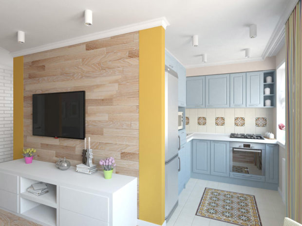
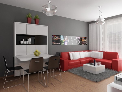
In general, take your favorite color as a basis and choose from the palette of its light shades. Also allowed to use in the interior of small rooms and bright colours. But they should be manifested in the form of small accents. For example, it can be a beautiful floor vase, a picture, small rug or sofa cushions. So that the color scheme of the apartment does not resemble vinaigrette and is understandable and harmonious, it is recommended to use no more than 3 colors. Where 60% of the area should be occupied by the main background color, 30% - additional, and only 10% is reserved for bright details. By this the rule all interior designers use it, because it is only in this way that it is possible to build a correct and easy-to-read color composition.
9. Requirements for furniture
In cramped conditions, each item has its own place, which is strictly limited. It is this approach that makes it possible to rationally use space. All pieces of furniture that are selected for a one-room apartment, must answer as follows requirements:
- Have the simplest and most correct form;
- Have hidden storage, that is, be functional;
- Pay attention to modular designs, which, if necessary, can be separate elements;

- As a dining table, it is better to choose compact folding structures;
- Coffee tables can also be transformed into full dining tables for 4-6 people;
- Expensive, but the most functional acquisition will be transformer furniture. A sofa or bed, made in such a way, will save a maximum of free space;
- It is better to use mirrors as facades of sliding wardrobes;

- Some beds are equipped with shelves around the head of the bed - a great way to place pleasant little things;
- Get only really necessary furniture, which you can’t do without. This will not clutter up the space;
- Dark furniture in small rooms will look just gigantic and massive, will create a pressing sensation. It is better to use natural wood shades of light tones or white facades.

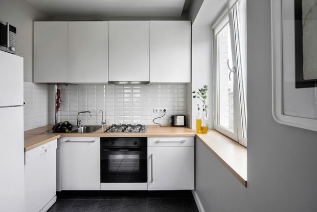
10. Kitchen design in Khrushchev
Many people wonder - how to do premise an area of 6 sq.m. not only beautiful but also roomy. With the proper approach, it’s very simple:
- Be sure to use the windowsill as a continuation of the work surface;
- Choose a compact built-in technique of minimum size;

- If the family is small, there is no need to buy bulky and tall refrigerators + Separate freezer. Enough medium sized fridge;
- Be sure to replace a conventional stove with a hob and a separate oven;
- Use slim series built-in hoods. This will allow not to take away space, but to give it under an additional wall cabinet, plus hide communications;
- If there is such an opportunity - use the space around the window opening for the organization of closed or open shelves or racks;
- Glossy facades of light shades will reflect more light and help expand the boundaries;

- A glass or plastic transparent table will seem less overall;
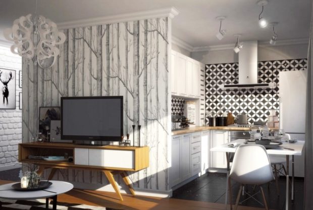
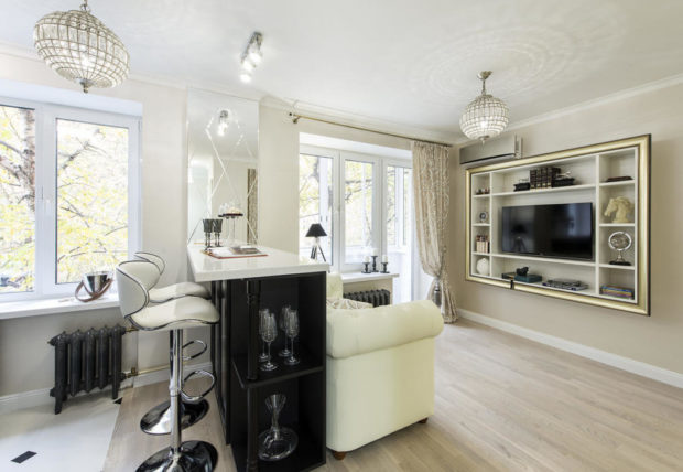
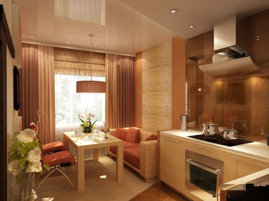
- If there is no acute need for a complete dining group, replace the table with a bar counter or kitchen island, which can be additionally equipped with shelves, cabinets. This method is especially popular in kitchens combined with the living room.
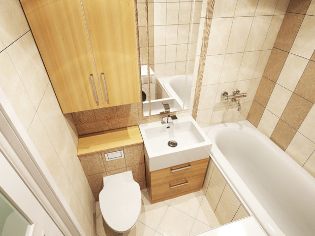
11. Features of the design of the bathroom
The bathroom in one-room Khrushchev is truly a standard of compactness. Putting everything you need there is sometimes an overwhelming task, but we can handle this:
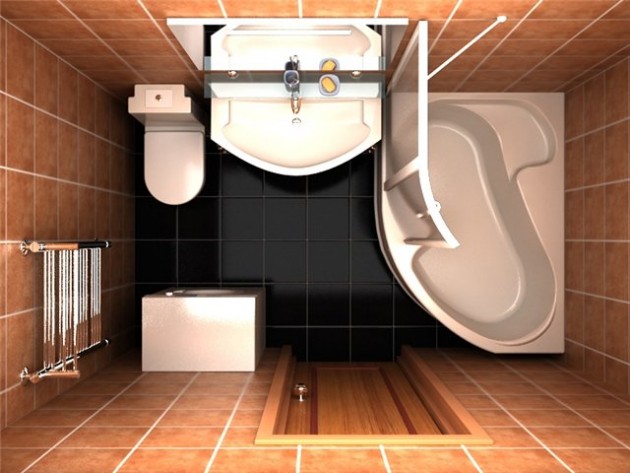
- The most important element in this room is the bath. However, most use it only for taking a shower. In this case, it is more reasonable to get compact shower stall;

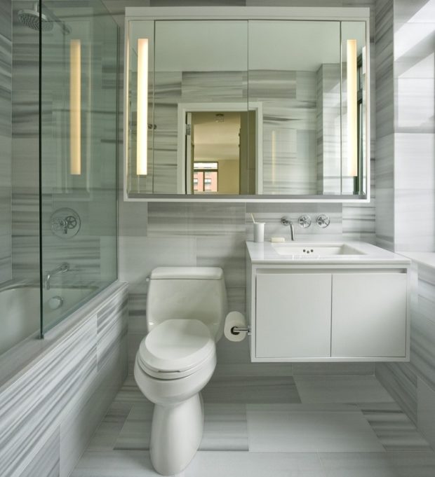
- Wall hung toilets will look smaller than they really are. But cleaning in the room will immediately become more convenient;
- Try to place as few objects as possible on the floor. Use hanging cabinets and sinks;
- For the storage of household chemicals, it is better to purchase a flat cabinet, the facade of which will simultaneously be a mirror;
- It is very important that this small room is always tidy. No need to place many shelves on the walls. And if you decide to hang - use glass. Do not hang a full set of towels on the entire wall. It is better to twist them beautifully with a dense roller and put the pyramid on an open shelf under the sink;

- If it is not possible to take the washing machine into the kitchen, select the compact model, above which you can place the washbasin, or which you can even hang on the wall. Typically, such models are designed for no more than 3 kg of linen;
- Choose bright decoration materials and do not forget about the backlight.
12. The interior of the living room in the one-room Khrushchev
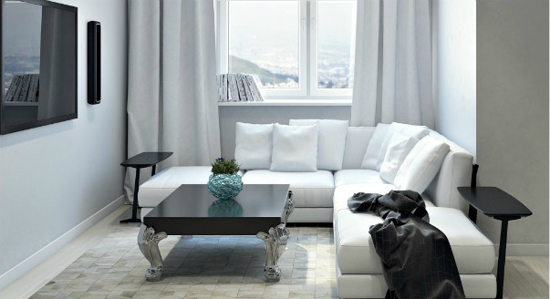
In fact, the living room should fit Total two pieces of furniture, which are absolutely necessary for absolutely everyone - a sofa and a wardrobe. The remaining items are purchased based on the size of the remaining free space and the real need for them.
- Definitely worth it refuse from the usual way to place the TV - on the pedestal. It would be much more reasonable to hang it on the wall with the help of special brackets;

- If there is a free corner, it is better to choose a wardrobe of angular design. Such models look compact, but in fact they can accommodate a large number of things;
- Do not use a large number of decor items. It is also important to keep track of their size. A large picture on a narrow wall will only emphasize the modest size. Many small elements are also undesirable. 4-5 medium sized items will be enough;
- It is also worthwhile to carefully monitor whether the dimensions of the furniture are commensurate with the size of the room. Too deep and wide cabinets will “bulge” out of the wall, as if they were cramped there. A large sofa will turn a small room into a tiny one, if there is no free space around it;

- If you have a personal library, place it on an open U-shaped rack that is better placed under a wall with a TV. If there is such an element, other decor items should be discarded;
- Also, do not use several carpets in one room. If you want to make the floor warmer, it is better to immediately cover it with a plain carpet around the entire perimeter;
13. What to do with a small hallway
The entrance hall in Khrushchev did not go far from the bathroom in the area allotted for it. The most unpleasant in the interior of any corridor, of course, which is not combined with the living room, is lack of source natural light. Knowing about this drawback, you need to try to eliminate it and use it. powerful lighting fixtures.
- If redevelopment is carried out, then you need to provide a niche in which you can install a small closet or hanger for outerwear;
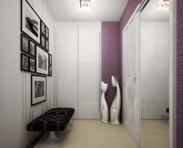
- Otherwise, it is better to limit yourself to the following pieces of furniture - a cabinet for shoes, a floor hanger, a mirror, a pouf or a small banquet;
- The interior of the hallway is best maintained in bright colors;

- The place above the front door can be used for mezzanines, where it is convenient to store shoes in boxes;
- By the way, the front door itself can be used as a clothes hanger by screwing a couple of hooks to it.
14. Organization of a children's room in Khrushchev
The question that worries many young families is how to find a place for organizing a nursery? It is really not easy to do this, most often such apartments lack a sleeping area for adults. Her role is a folding sofa in the living room.An exception is the case when the parents' bed is installed on the combined balcony. But in this case, really high-quality heat and sound insulation will be required. However, such an option also has a place to be.
- In order not to deprive yourself of the joy of having your own bedroom and a nursery, you can take out the play area or the child’s desk on the balcony;
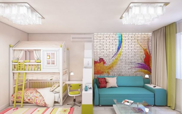
- As a partition, it is better to use a mobile screen, which is easily removed as unnecessary;
- Also, do not forget about the attic beds, which are a full-fledged place for classes on the first floor, and a berth on the second;

- For older children, buy a bed with built-in drawers, this will allow you to refuse to purchase additional furniture;
- Use toy baskets;
- Many desks have extensions, on which it is convenient to store textbooks and other needs;
- Remember that the child does not need a large amount of furniture, it is more your needs than him. Therefore, it is better to leave more space for the game.
15. How to fit a study in a modest apartment
It so happens that many urgently need a study in the apartment. It is difficult to call this small site a full-fledged office, but in terms of functionality it will not be inferior to a large office.
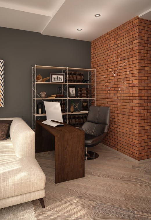
- What should be in the office? It depends on your occupation. The vast majority is a computer or laptop and a small table with a chair. Less often - a table for cutting, drawing, sketching. Accordingly, a couple of square meters is quite enough for us;

- About accommodation cabinet on the balcony we have already said. This is almost perfect. You can also work in the living room if you equip a window sill for this, and place several shelves around the window opening. It remains only to put a small chair. The advantage of this solution is maximum lighting;
- If more space is required, you can use tables that are equipped with castors and an outgoing wing or book tables;
- If the balcony was combined with the room in such a way that the balcony block was not completely dismantled, but an “island” remained, feel free to use it as a working area;

- At the storage room you can equip the necessary conditions.
16. What is NOT worth doing when developing a Khrushchev design
Recommendations for the design of a one-room Khrushchev we reviewed. Now let's list the few points that are better. to avoid in the interiors of small apartments:
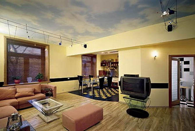
- In no case do not use finishing materials with large or similar patterns. Take a look at the photo below. For the decoration of the walls were used wallpaper in a wide strip, which are pasted onto several walls. Firstly, the interior immediately began to merge, the strips seemed huge, and the room was small. Secondly, all the efforts connected with the redevelopment instantly came to naught. Prefer monophonic surfaces;

- In the same photo you can see how gloomy the room looks without the proper level of lighting and how rude the dark pieces of furniture look;
- Avoid a large number of small decor items;
- You should not choose multi-colored shades for a ceiling arch - only white color. Otherwise, the ceiling will instantly press on the head;
- The best flooring will look light gray or white tones;
- Do not use unnecessary furniture and do not choose massive models.
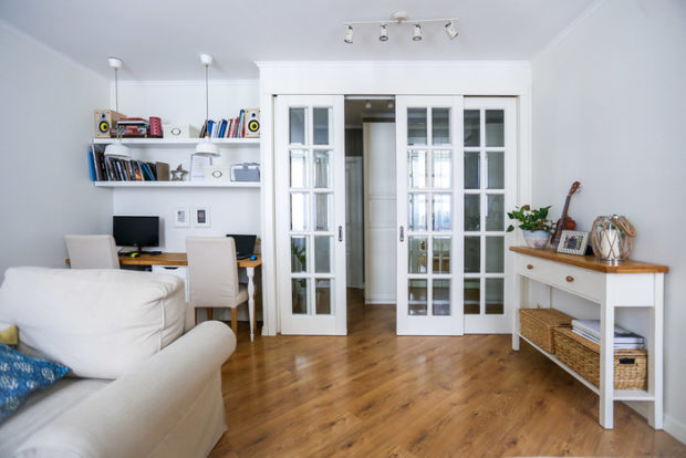 Adhering to such simple rules, you will be able, without outside help, to turn your previously hated Khrushchev into a comfortable home that you want to return to after a hard day.



 The desk is equipped with wheels, which allows you to move it to the center of the living room when guests arrive. The capacious case is presented by an angular model. And the most pleasant thing is that the bathroom managed to fit a full rectangular bathtub due to the fact that narrow plumbing was used and
 In addition, it is equipped with blackout curtains, which even in daylight provide complete dimming. In the bedroom under the wall there is a large wardrobe with glass facades. This technique makes it possible to create a perspective that visually increases space. Another smaller closet is located in the hallway. The living room is combined with the kitchen, and at the border there is a dining group.